
The rental market in Vancouver is very expensive, generally having some of the highest rents in the country. In this analysis, I look at the differences between Montreal and Vancouver’s rental markets looking both at the rent cost itself and then the rate of affordability (something the CMHC defines as no more than 30% of income).
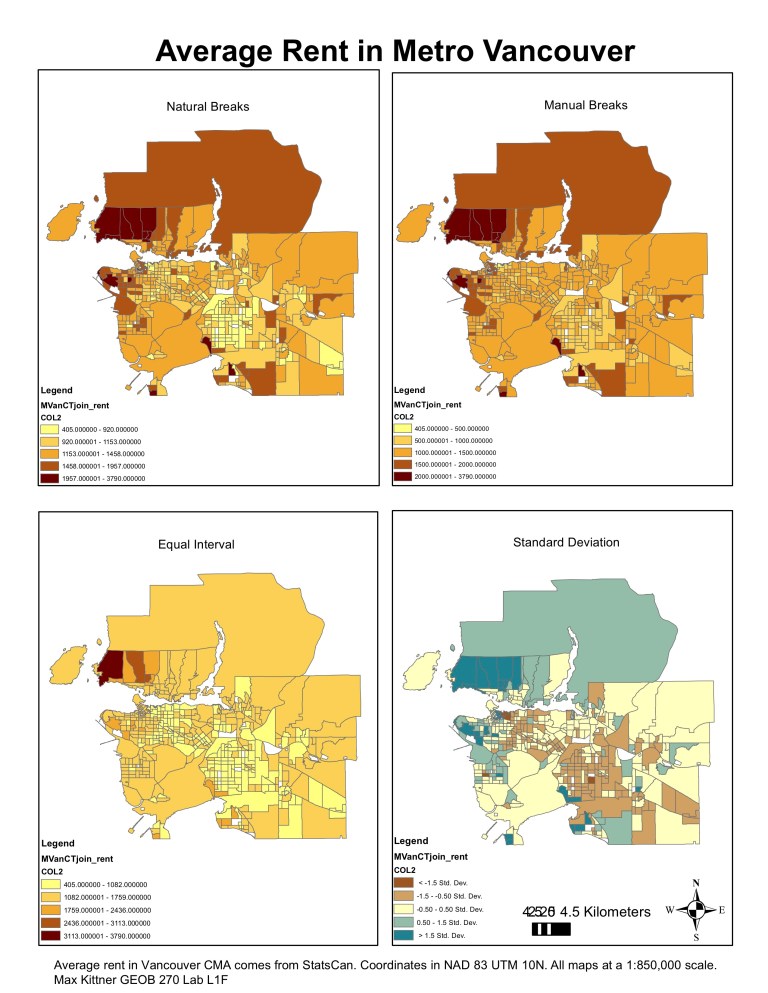
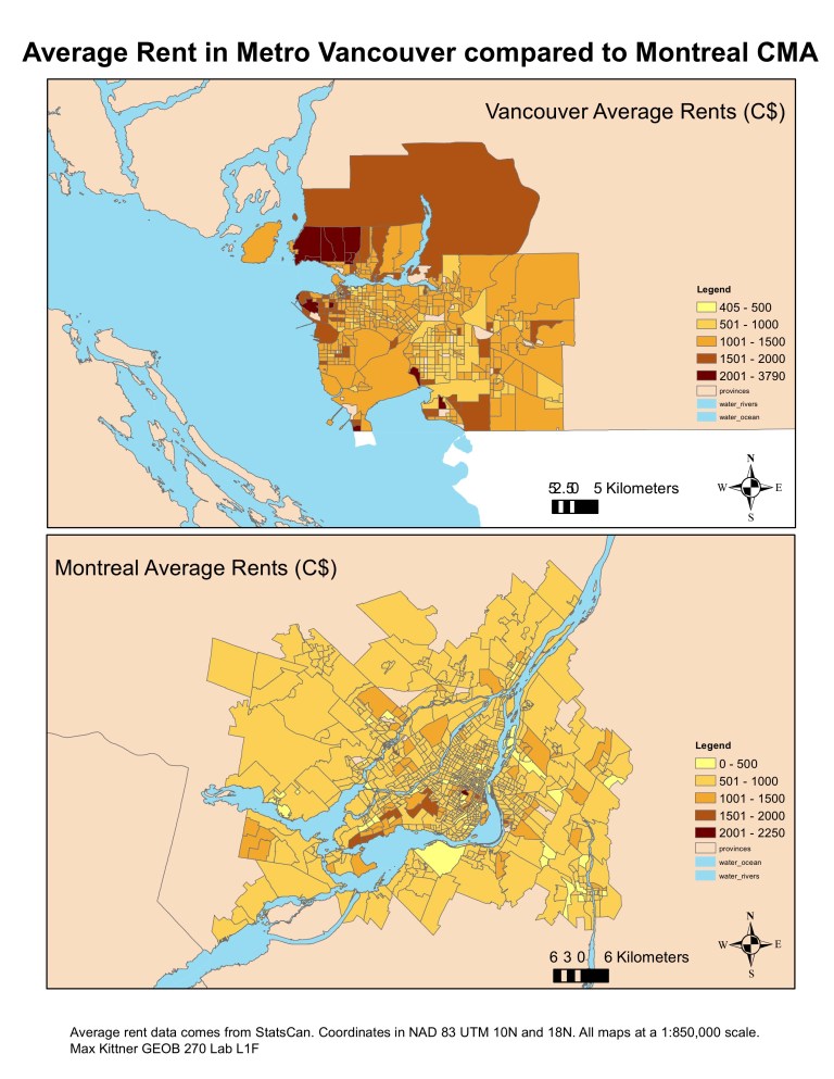

The maps begin with understanding how to display data differently. After sourcing data from the Canadian Census and CHASS, I was able to display Metro Vancouver’s average rent by census tract. The four main methods in GIS (natural breaks, manual breaks, standard deviation and equal interval) all displayed the same data very differently. To make it more palpable for viewers of the maps to make a comparison between Montreal and Vancouver we settled upon manual breaks, using 500 dollar intervals until over $2000. This ended up showing considerable differences between the two cities’ rental markets. To go a step further, we compiled maps that looked at affordability ratios for renters in each census tract. The result was quite stunning, not only was Vancouver more expensive in rent, but a larger part of people’s paycheques was directed toward rent payments.
In Summary:
- I was able to compile census data and spatial boundaries to analyze rental disparities between different cities.
- I learned how to visualize the same data under different classifications to showcase how to display information for various scenarios.
